Introduction
You don’t want to make colorblind unfriendly garbage do you? No? Great, let me show you why ggplot2’s default color palette is exactly that, using the package colorBlindness. In fact, let me show you why it’s actually not a great palette for folks without colorblindness either. You can skip to the bottom to find the code I used to make this.
The Color Variants
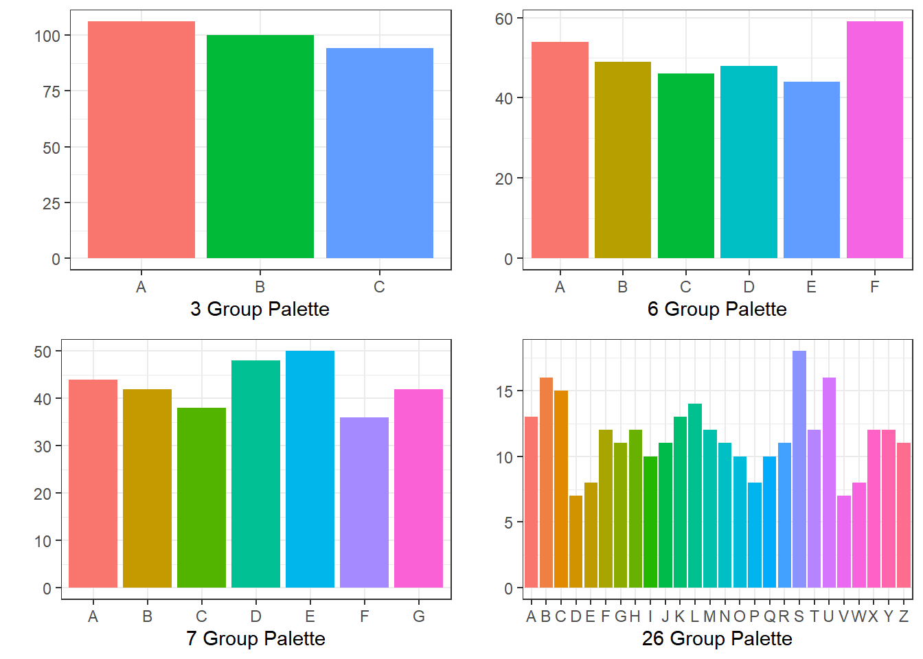
The ggplot default color scheme does adapt colors as you add groups, becoming more and more rainbow. Pretty, right?
Cool. Let’s look at what would happen if you printed these plots out in grayscale.
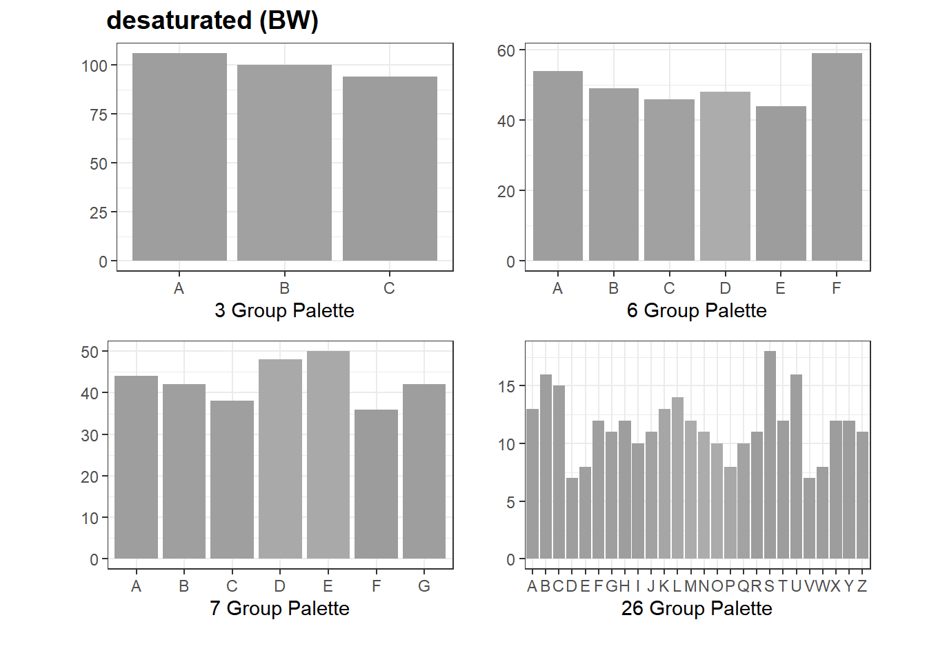
Wow. So distinct. Such a pretty, uniform form of grey! Turns out that no matter how many categories you add, the ggplot2 scheme retains uniform levels of black and white inside those colors. You don’t get dark, you don’t get light, you get grey + color. So if you print them in black and white, you just see the uniformity. But that’s not all! Even with color present, this color scheme isn’t distinguishable for colorblind individuals. Here’s a simulation of what those colors might look like in someone with deuteranopia, the most common form of colorblindness.
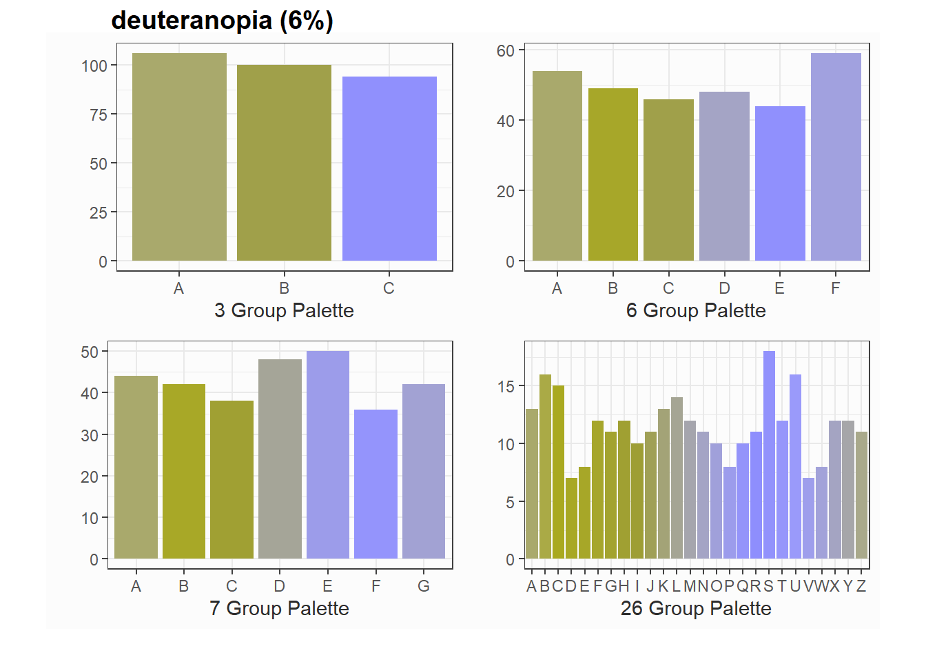
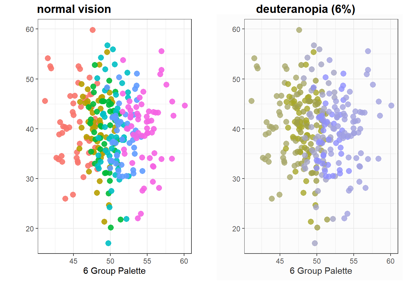
Once you start to get about 6 or more groupings, the ggplot2 color scheme starts to break down for colorblind individuals.
You Can’t See This Either
Now if you’re not color blind you’re probably thinking, well, as long as I don’t have more than 6 groups and I’m not planning on printing it out in greyscale we should be good, right?
Sure. In a bar plot, where the color doesn’t mean anything anyhow. But scatterplots are a different story.
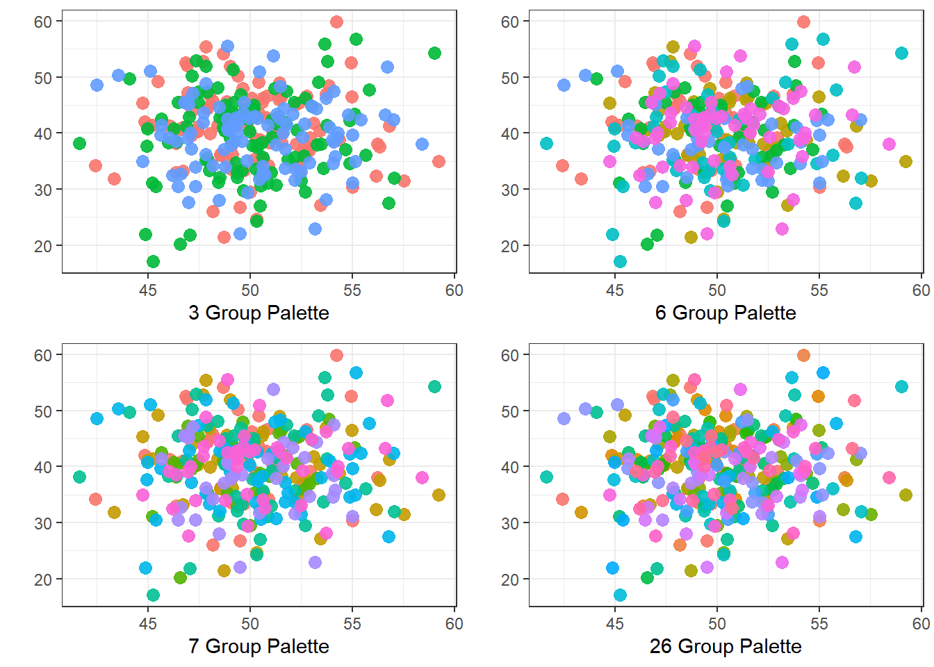
Can you honestly look at anything above the 3 and tell me you can clearly count how many categories there are without prompting? Some of the colors will probably pop out to you more than others, but all the same, it’s not going to be easy, is it?
Now, part of this is because the data is massively overlapping, which definitely makes life harder. That said, let’s look at some cases with less overlap.
Better Options
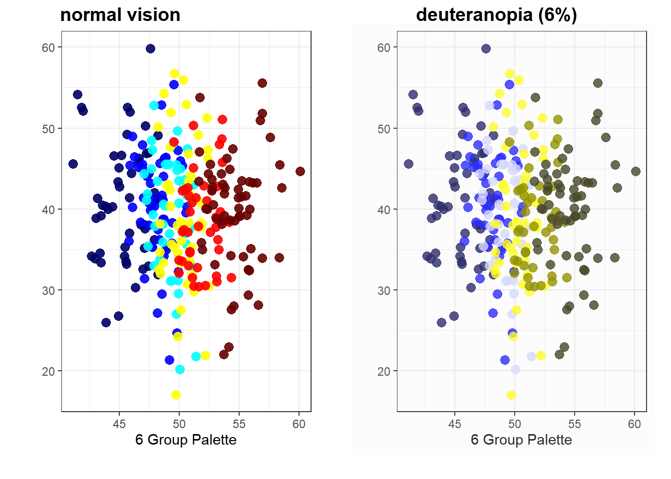
There are so, so many better options out there - and like the default color scheme, there are even versions that don’t require you to think very hard about assigning colors! You could use the jet.colors() function from the sommer package for example.
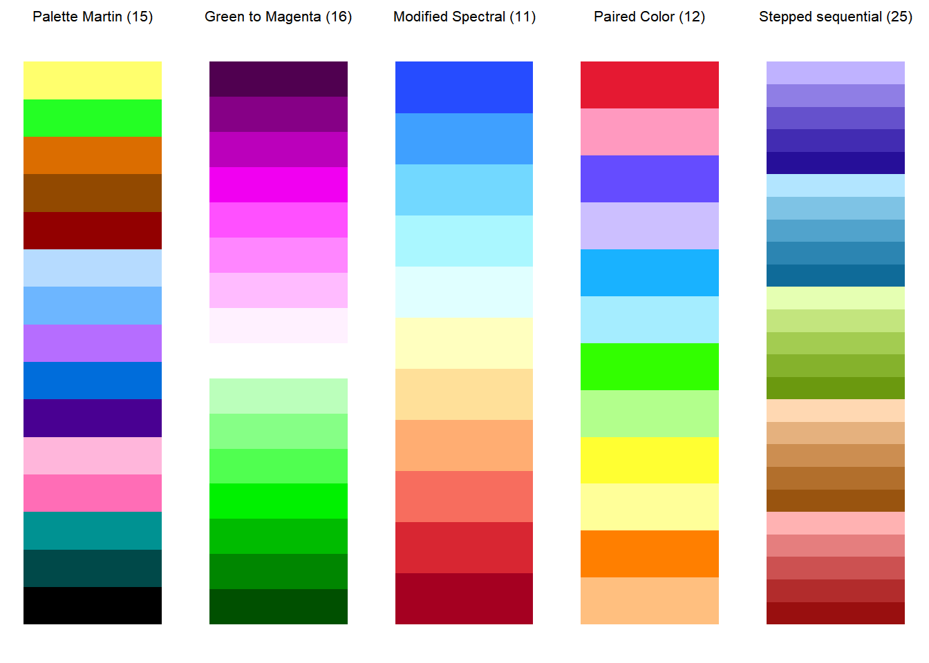
 The colorblindness package comes with a number of suggestions! All of these are colorblind friendly and print in something other than just the same grey over and over again. They have as many as 25 colors, though if you need that many colors, you probably actually don’t and should look at adjusting your plot somehow.
References
colorBlindness package vignette
“The End of the Rainbow? Color Schemes for Improved Data Graphics”
The Code
Wanted just the code with no interruptions? K. Here you go.
# Packages
library(ggplot2) #graphics
library(gridExtra) #make graphics go together
library(colorBlindness) #pretty self explanatory I'd say
library(sommer) #jet.colors
# To show these problems, let's make some fake data.
# this is sort of standard randomized
x <- rnorm(n = 300, mean = 50, sd = 3)
y <- rnorm(n = 300, mean = 40, sd = 7)

# This is to make scatterplots with some overlap but not much
x1 <- jitter(sort(x), amount = 2)

# using letters as our categories
group3 <- sort(sample(LETTERS[1:3],size = 300, replace = TRUE))
group6 <- sort(sample(LETTERS[1:6],size = 300, replace = TRUE))
group7 <- sort(sample(LETTERS[1:7],size = 300, replace = TRUE))
group26 <- sort(sample(LETTERS[1:26],size = 300, replace = TRUE))

# put it all together
tog <- data.frame(x, x1, y, group3, group6, group7,group26)
# Here is a custom function showing you what bar plots
# look like when you have more and more groups.

plotfun <- function(num1){
  ggplot(tog)+
    theme_bw()+
    geom_bar(aes(x = .data[[paste0("group",num1)]], fill = .data[[paste0("group",num1)]])) +
    theme(legend.position = "none")+
    labs(y = "", x = paste0(num1, " Group Palette"))
}

barplots <- grid.arrange(plotfun(3),plotfun(6), plotfun(7), plotfun(26))
barplots
cvdPlot(barplots, layout = "desaturate")
cvdPlot(barplots, layout = c("deuteranope"))
# This is a custom function to create scatterplots instead
plotfun2 <- function( whichx, num1){
  ggplot(tog)+
    theme_bw()+
    geom_point(aes(x = .data[[whichx]], y = y,
          col = .data[[paste0("group",num1)]]), size = 3, alpha = .9) +
    theme(legend.position = "none")+
    labs(y = "", x = paste0(num1, " Group Palette"))
}

scatterplots <- grid.arrange(plotfun2("x", 3),
                             plotfun2("x", 6),
                             plotfun2("x", 7),
                             plotfun2("x", 26))
scatterplots
cvdPlot(plotfun2("x1", 6), layout = c("origin", "deuteranope"))
cvdPlot(plotfun2("x1", 6) +
  scale_color_manual(values = jet.colors(n = 6)),
  layout = c("origin", "deuteranope"))
# a custom function to use the displayAllColors function but
# rotate the outcome and push them together

palfun <- function(x, y){
  colorBlindness::displayAllColors(x, type = c("origin")) +
  labs(title = y) +
  coord_flip() +
    theme(axis.text.x = element_blank(),
          axis.text.y = element_blank(),
          plot.title=element_text(hjust=.5, size = 8))

}

pl1 <- palfun(paletteMartin, "Palette Martin (15)")
pl2 <- palfun(Green2Magenta16Steps, "Green to Magenta (16)")
pl3 <- palfun(ModifiedSpectralScheme11Steps, "Modified Spectral (11)")
pl4 <- palfun(PairedColor12Steps, "Paired Color (12)")
pl5 <- palfun(SteppedSequential5Steps, "Stepped sequential (25)")

grid.arrange(pl1, pl2, pl3, pl4, pl5, nrow=1)